
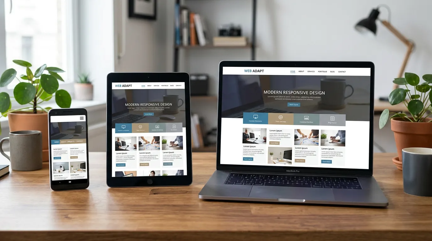
What is Responsive Design?
Responsive design is an approach to web design that makes web pages render well on a variety of devices and window sizes. Rather than creating separate mobile and desktop versions, responsive design uses flexible layouts, fluid grids, and CSS media queries to adapt a single website to different screens.
This means visitors to your website get an optimized experience whether they're on a smartphone, tablet, laptop, or desktop monitor.
Mobile-First Thinking
Modern design thinking starts with mobile. Instead of building a desktop site then shrinking it for phones, we design for mobile first, then enhance the experience for larger screens.
This approach ensures your most essential content and functionality work on any device. It forces prioritization—you can't hide important information behind confusing navigation, because mobile real estate is limited. This clarity benefits users on all devices.
Performance and SEO Benefits
Google prioritizes mobile-friendly websites in search rankings. A responsive site isn't just good for users—it's good for search visibility. Additionally, responsive design improves loading speeds and reduces bounce rates, creating a virtuous cycle of better UX and better rankings.
ProDesign Houston builds every website with mobile responsiveness as a core requirement, not an afterthought.